Film Reviews
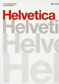
 Helvetica (2007)
American Airlines hasn't changed its corporate logo in forty years, and there's a good reason why: it's one word in a clean, simple, rational, and entirely unobjectionable font called Helvetica. Created by the Swiss in 1957, Helvetica is like the air or gravity, like painting your room white, or wearing khaki pants and a navy blazer. Helvetica does not need or want any exclamation points. For typeface designers and graphic artists Helvetica was like "a landslide waiting to happen." And it did happen, especially after Helvetica became the default font for Apple and then Microsoft Windows (Arial). Helvetica is one of the most ubiquitous cultural artifacts you could identify. Anywhere you look you will find Helvetica — a tax form, the numbers on the top of a bus, the font on the side of the Challenger space shuttle, the signs for the NYC subway, etc. In many ways it's the perfect metaphor for modernism, which is why post-modernists consider it dull, lifeless, conformist, corporate, and utterly lacking in any personality. Grunge typographers loath it still, and replace it with their contorted fonts placed every which way. Producer-director Gary Hustwit interviews over a dozen "typo-manics" of various persuasions who explain how and why Helvetica is the ultimate form and content of a globalized aesthetic. This is not only an interesting film in itself, but a fascinating piece of cultural analysis of our (post) modern visual world.


